Providing perspective
Our challenge was to design a UI kit that provided structure without making the website feel dull. Too much rigidity often leads to flat, uninspired layouts. We turned this into an opportunity to create a fresh visual space that balanced consistency with energy.
Designed
Decisions
Typography was central to the brand, so we chose typefaces that felt fresh yet highly readable across devices. With a clear hierarchy and select visuals, we balanced structure with vibrancy, creating space for content to stand out.
Balancing the image to content ratio within the design system itself
Adaptive, yet responsive design
Building a mix of adaptive and responsive design system so that scalable components feel natural on the viewing device. Balancing brand integrity with usability and performance means rethinking, not just replicating. It’s where fixed design meets living systems—and alignment is everything.
Atomic design structure
Built on WordPress, the site required a robust design library to scale across pages and content types. We coded an atomic system, giving client teams the flexibility to customize content by style, functionality, and use case while maintaining consistency and cohesion.


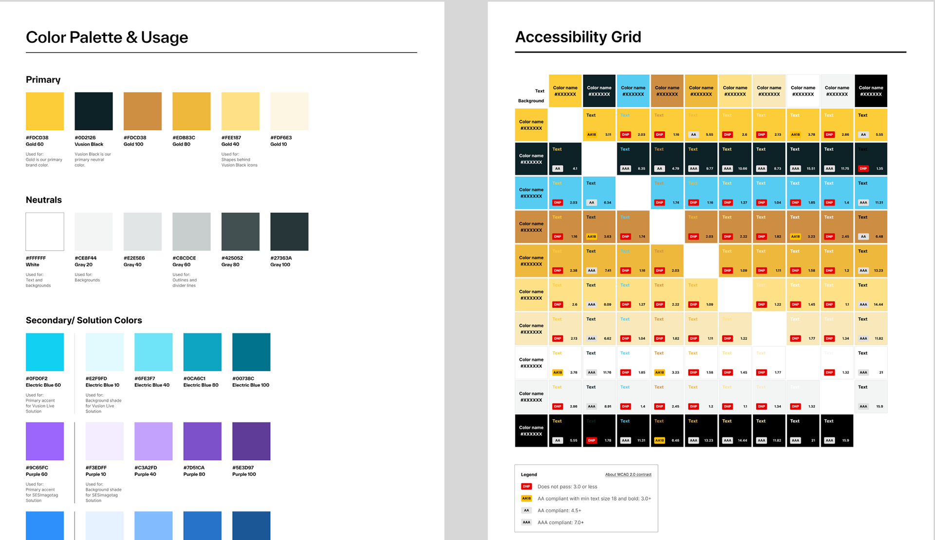

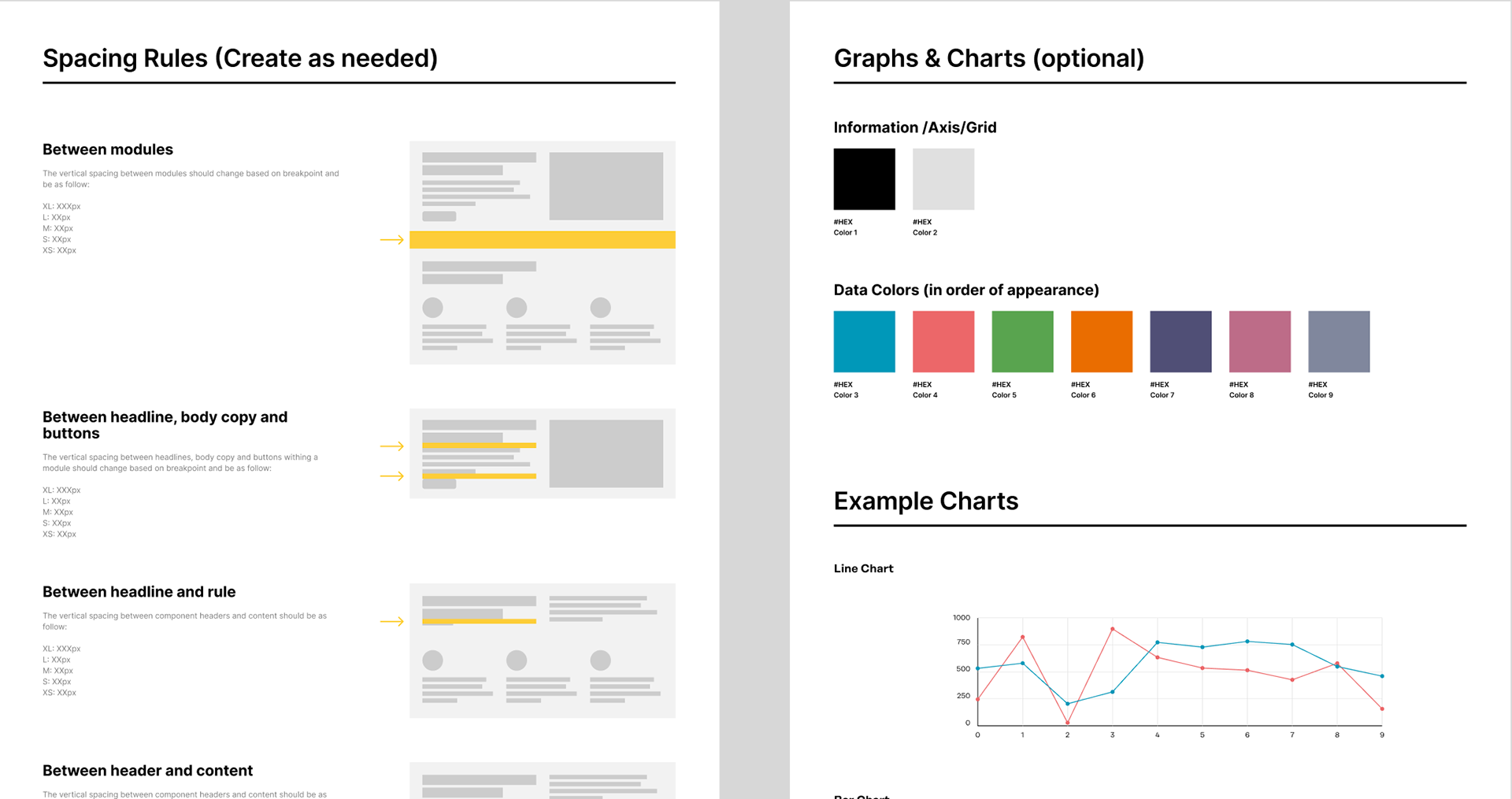
We also coded the atomic structure within the brand guidelines and the UI kit.
Design for interaction
We designed a custom tab system to house multiple content pieces within one module, allowing users to focus on one item at a time. Rather than relying on generic WordPress components, we built tailored interactions with subtle micro-animations, creating a fluid, intentional, and enjoyable experience.
To help users navigate the brand’s rich content, we designed hover states that bring focus to what matters. When hovering over a card or object, the image subtly zooms in, drawing attention to the content at hand. This simple yet effective interaction guides focus, reduces distraction, and makes browsing more engaging.
One brand.
Online and Offline.
Although conceived as a digital-first design, the system also needed to translate seamlessly into the physical world. I collaborated closely with the offline branding teams to adapt core elements for print and static applications, ensuring the brand’s digital essence was preserved across every touchpoint.
One of the core challenges was to bring a unified brand live, while still keeping the multiple smaller brands active. I oversaw the development of a cohesive brand experience—from visual identity and design systems and user touchpoints; ensuring every element aligned with the new positioning: innovative, intelligent, and globally unified.


